Tuesday, 30 November 2010

Evaluation : Question 3

Audience feedback has been collected in several different ways. The first was through a questionnaire that focuses on qualitative information. This questionnaire was given to a mere 20 people to answer, and these were all people within the already defined age bracket so relevant feedback could be gleaned. The questionnaire was created with a seperate section for each of the three products, so feedback could be collected on each individually.


I learnt from this feedback that the products were an overall success, however that the heroin scene did carry on slightly longer then expected. Also the main aspect that was appreciated was the editing, how it was in time with the sound track, this proved my research that media films that are targeted towards the youth are often edited in this way as it keeps their attention and involves them in the story. The poster was rated in between 8 and 9 which proves its impact and the overall rating for the double page spread was a high 9 and the highest points were rated the layout and the use of images, from the sets, and the film itself. 95% said they would purchase the review, and 87.5% said they would watch the film that the poster was advertising, based on the poster. This shows that the three products are a success. 


The second was through posting the video on the popular social network  FaceBook and video community YouTube to collect a larger selection of comments and feedback. Here a few examples of the comments.


This feedback shows the success of the products from a wider base. A few comments were from people above the target age which proves that the product can be enjoyed by audience members outside of the target audience. This was the true test of the product, to be a success as a niche and mainstream media text. Also it showed that the despite the low production costs, the use of a strong concept carried the story through. The lighting was also commented as strongly complimenting the film. This feedback proves the success of the product as it was received well with high reviews from its audience.

Evaluation : Question 2

How effective is the combination of your main product and ancillary texts? 

Monday, 29 November 2010

Evaluation : Question 1


In what ways does your media product use, develop or challenge forms and conventions of real media products?


The main Media product was a short film entitled “Straight to the Moon”. Before beginning my film making process different codes and conventions of short films had to be analysed, so that certain aspects of a real looking product could be replicated. The research of short films showed that they were used to convey concepts to their audience as opposed to complicated story lines.  Short films are about ideas, and how those ideas can be communicated within a short time frame, and simple story, many with simple setting and low production values. The short films that were analysed also used objects such as credits and titles, which have been added to the film. For the credits a soft edge in the frame was added to create a more realistic feel for the audience without the affect being to invasive. In planning the shots for my short, many short films were analysed, but also media products that had been created for the films target audience. The English TV dramas “Skins” and “Misfits” were researched for the type of angles and shot lengths that are used and what they are used to convey. It was found that extreme close ups are used to convey an intense emotion or an important act, which have been included in my film, also that stedi-cam and handheld effects are used to connote an unsteadiness or intoxication. Also scenes with non-diegetic sounds are often edited to those sounds, not unlike a music video.
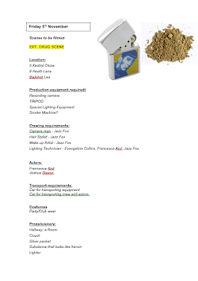
Faced paced shots are used often in clubbing scenes in “Skins” to convey confusion and chaos, which it was believed were necessary in my film, and so the editing and filming style was adapted to include these aspects. In editing effects such as the 180-degree rule and cross cutting were used to ensure continuity and passing of time.
 Many of the short films that were researched used some of the music within the film as the backing track for the credits to ensure consistency; ergo “Sad Theme” was used behind the credits. This was also used to give the audience the feeling of familiarity, and leaves them feeling at ease, which is preferable to using a separate track and overloading their memory with sounds, as opposed to letting them remember the important message of the film, this also ties in with short films being about concept.


The well-known convention of changing the lighting and colouring of shots to show flashbacks and emotion was also applied. The black and white shots make it easy for the viewer to understand the timeline of the short film.
During the research I discovered the convention of characters in a short films not looking directly at the camera as an object, but only to show characters looking at each other, but generally to avoid eye contact with the camera as an aspect within the film to not break the perspective of the audience. This convention was challenged in “Straight to the Moon” and adapted for the product. The camera was treated as a mirror, so the character looks directly at it and sees herself in it. In this way the camera became a part of the story as much as any of the other props, and also became the reference point for the end of the film, so not only can we see her reaction, but she can also see her life being played for her as if she were looking in a mirror. 

The ancillary texts that have been chosen are a double page spread review and a film poster.

 It was discovered in the research that film posters generally follow a certain set of rules when they are created for film features. Blurbs from reviews, comments by respected industry name are often featured to lend validation to films; the credits are almost always placed at the bottom or top of a poster, and are in a specific lighting. There is also often one main picture that takes up the entire frame. This picture may not always be from a scene within the film, but it will often depict a character from it, perhaps dressed as they are in the film, showing a major emotional theme of the film. These conventions were adapted to the poster to make it into a real to life product.
A close up shot of the lead character was used, looking over her shoulder in fear. This could be interpreted as the character fearing for her well being from her abusive boyfriend, or her fear of her past which is following her and making her choose destructive decisions for her future. The credits were placed at the bottom of my poster, in the font used by filmmakers and added blurbs of my own invention. “This Winter” was also added at the bottom of the poster as much of the research showed that posters often included the feature’s release date, or if they were highly in advance, then the season of the release. In conclusion the research, consideration, and adaptation of the codes and conventions used by the film industry in making film poster has had a positive impact of the overall success of my product.

The double page review also is in line with the forms and conventions of real media articles. Research of double page spreads showed that a large amount of pictures are featured in review, to catch the reader’s interest, and to illustrate the points made in the article. Different selections are generally used, from the making of, the film itself, and perhaps the poster. Consequently a photograph of the filming was added in the top left corner, a large screen shot from the actual footage was displayed largely across the two pages for the film to be associated with, and a smaller picture that was discarded from the poster at an earlier date was added.
A fact box was added to stay in line with conventions, as a snapshot of all the most important information such as the rating, release, and actors, which is used for the members of the audience who are simply glancing through the articles so they can still collect the information they need. Columns were used to create an easy way for the audience to read the article, while still allowing space for pictures as this convention was widely noticed in the research. Trivia from the making of the film is added in an individual box to interest readers in the making. Blurbs from throughout the article are enlarged and placed within the text to draw the reader to the article and capture their attention to ensure they read its contents.  
At the end a conclusion and a out of 5 star rating is featured, this gives the audience a quick overview of the article so they get understand the general message of the article whether they have just read the article, or they simply wish to know the rating in general to suggest a guideline as to whether the product is worth watching. In conclusion all the main conventions of a double page review including page numbers and website addresses were developed and adapted to ensure the final product looked like a real life media product that its audience would read in a film magazine.


Sunday, 28 November 2010

Introduction to Evaluation

I have chosen to create a short film in its entirety, lasting approximately five minutes, consisting of live action.

My two chosen ancillary options are

  • a film magazine review page featuring the film.
  • A poster for the film  
My products are targeted towards men and women bewteen the ages of 15 and 22, but is also suitable for other age groups.  

Saturday, 20 November 2010

Filming "Straight To The Moon"

Due to the disadvantage of being a group of a single member, I had to film many of the shots with a non-moving camera. I often had to set up the camera from an angle and then move in front of it to act the scene.
In one of the party shots I made a harness and attached it to the tripod of the camera so that when I span on the desk chair, the camera would move with me.

Friday, 19 November 2010

Music For Party Scene/ Drug Scene

I downloaded the track "tech" from a copyright free music site- Jamendo


Thursday, 18 November 2010

Music - Sad Theme

For the beginning track of my short film I emailed a instrumental artist to ask if he could send me some backtracks that I could choose from for my film. 

He sent me seven tracks to choose from and I chose "Sad Theme" the artists name is "Unknown Artist" and he is an unsigned artist who creates his music for his own personal use.  He specializes in base and piano tracks. 


Tuesday, 2 November 2010

Double Page Content


Straight To The Moon Review 

Spoiler Alert!


The world of the modern teenager is constantly evolving, and with it is the media and programming with which they are being presented. The themes, motifs and topics that are being focussed on are different today then they were even ten years ago. What was once considered to be taboo for are now a commonplace subjects for discussion and depiction.

Where, in years gone by, a few love triangles and a good looking cast would have sufficed to entertain and receive critical acclaim, teenaged dramas now come with their own level of anticipation built in. Since the likes of “Skins” and “Misfits” graced televisions with their superb acting, low production costs, and compelling entertainment values, expectations have gone through the roof.
It was on these expectations that small time film fans awaited the latest production of “Cat and Dog Productions” – “Straight to The Moon”.
Thankfully “Straight to The Moon” did not disappoint, but instead revelled in those expectations and was gripping dramatic thriller that fulfilled its promises of high quality acting and perfect on screen chemistry.
“Straight to the Moon” is the perfect cocktail of drama, fear, moralistic questioning and suspense. It is the perfect short 5 minutes, and therefore manages, in that brief time, to surprise, shock and entertain; with scenes and ideas that make such an impact that I still have not been able to shake them. 
This, aptly titled short film is about a young girl who is faced with a small decision that could affect, and even determine, the rest of her life, and follows her decision through to the end. The film is concerned with the way that decisions are made, and the consequences of those decisions. Where a fork in the path to the future exists, a direction must be taken; a direction that could irrevocably alter the course of a person’s existence. This is a sphere that is extremely relevant to today’s young person, where individualism is paramount and our modern world offers a glittering array of freedoms and choices that have all have the potential to impact the future.

 Alongside this central premise, the film deals with a whole range of themes and issues that are current and topical to the modern teenager, such as love, relationships, drugs and abuse. These, sometimes shocking themes, are illustrated beautifully by the emotive scene changes and spectacular acting of lead actress.
Set in modern times in a normal suburban household, the characters are kept relatable and up to date with the realism of the costume design and sets.  The film has no dialogue and is therefore reminiscent the early 20th century era of short films, where directors had to rely on the acting, story line, and cinematography to create the end masterpiece seen on the big screen. The film is almost Avant-garde in its direction, with the atmosphere building up to a crescendo that finalizes in one climatic plot twist at the end.

The only real downside of this short is that the low budget is sometimes made glaringly obvious. Using reverse shots to save on time and keeping many shots short without much camera movement make it painfully obvious that the costs for the production were kept incredibly low. However, in this modern age of the “B movie” where low budgets are becoming less of an issue to the success to a film, I think it is possible to look past its production flaws to see the true feature-diamond beneath. Indie movies are becoming more and more popular and this film demonstrates exactly why: it is in touch with its audience and has a relevant and legitimate message. “Straight to the Moon” has its proverbial finger on the pulse of the modern teenager.

Overall, despite its flaws, a strong cast, a solid screenplay, fantastic performances by the main lead and supporting actors Francesca Aird and Joshua Dixon, and thoughtful execution make this short film a must watch for this year. This film gives a chilling new reference point and meaning to the well known, well quoted phrase "Bang, zoom, straight to the Moon!”

Monday, 1 November 2010